nn
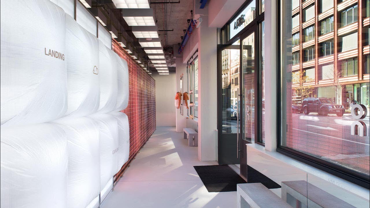
On Running / NYC Flagship Store
Designing the employee tool behind a physical running analysis
For On Running’s NYC flagship, I designed the employee product that connected foot scan and running analysis with the in-store consultation.

01 From in-store analysis to employee workflow
Three physical touchpoints. One employee workflow.
The store experience moved between a foot scan, a running analysis and a personal consultation.
I designed the employee-facing product that kept the customer context together as staff moved through the service.
Employees needed to create or find a customer, see which analyses were complete, guide the next step and return to the results during the consultation.


02 The organising model
One customer profile connected the experience
I used the customer profile to keep identity, foot-scan information, running analyses and progress in one place.
That gave employees a stable view of what was complete, what was still open and which information they could bring back into the conversation.
The runner was at the centre of the service, but the employee operated the product.


- CustomerFind or create a profile
- StatusSee completed and open steps
- ScanReview left and right measurements
- RunsKeep multiple analyses in one context
03 Running analysis
Giving running data a shape
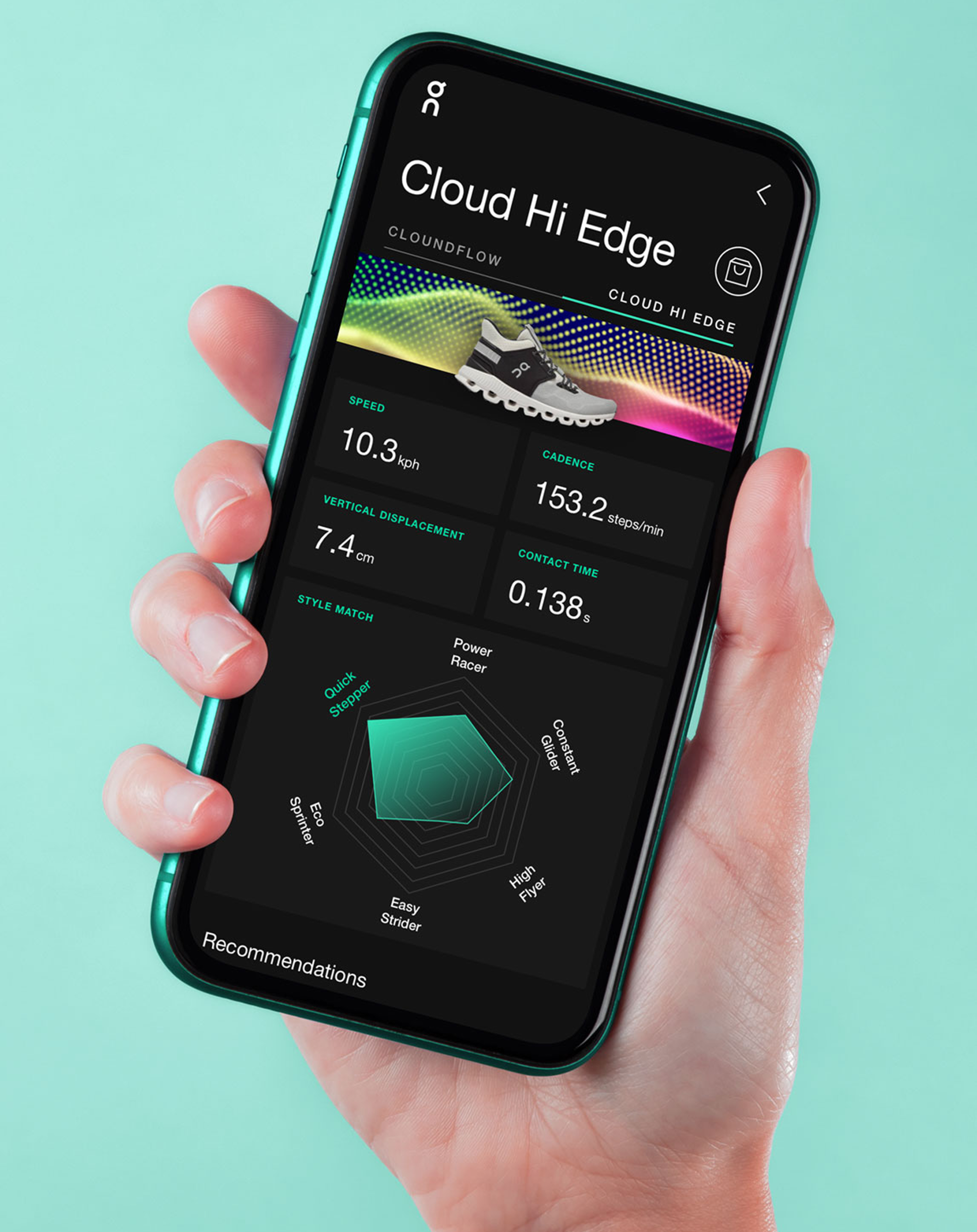
The analysis contained speed, cadence, vertical displacement and contact time. A list of values made the overall pattern hard to read, especially when an employee wanted to discuss more than one run.
I designed a radar-style view that kept the measurements visible and gave each analysis a recognisable profile. Multiple runs could sit within the same customer record and be compared in the product.

04 From structure to product
Carrying the interaction model into the final UI
I developed the screens from early light UX concepts into the later dark interface, carrying the interaction model into the final composition.

05 Shanghai / WeChat
A different context needed a different customer output
The planned Shanghai flagship introduced a new customer touchpoint. The NYC concept used a simpler email result. For Shanghai, I explored a richer one-page result within WeChat.
I researched the unfamiliar platform directly, clarified the local requirements in calls with a Shanghai counterpart, and developed the mobile and desktop concept. The screens below show the desktop direction and the mobile WeChat output.


06 Scope
What was created
The work produced an employee-facing mobile product concept for the flagship service. It included customer management, profile and status views, foot-scan summaries, running-analysis screens, comparison between runs and recommendation-related product views.
I also created the separate Shanghai and WeChat concept, with its own flow and customer-facing result direction.
Continued collaboration
On Running later commissioned me for a separate planning-room product.
It was a different project, but it extended the client relationship beyond the flagship-store work.
07 Reflection
Looking back
The useful distinction was between the person at the centre of the experience and the person operating the product. The runner saw a personal analysis. The employee needed structure, status and control behind it. I still look for that difference when a digital product supports a service that moves through people and physical space.

n