

Earlier work
Evangelische Bank
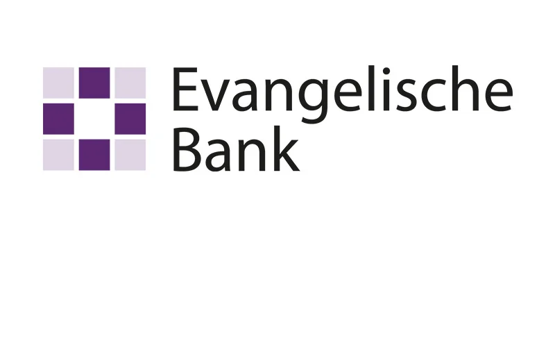
Evangelische Bank was formed in 2014. While freelancing for Fazit Design, I worked on the bank’s new logo and an update to its website design.
Project
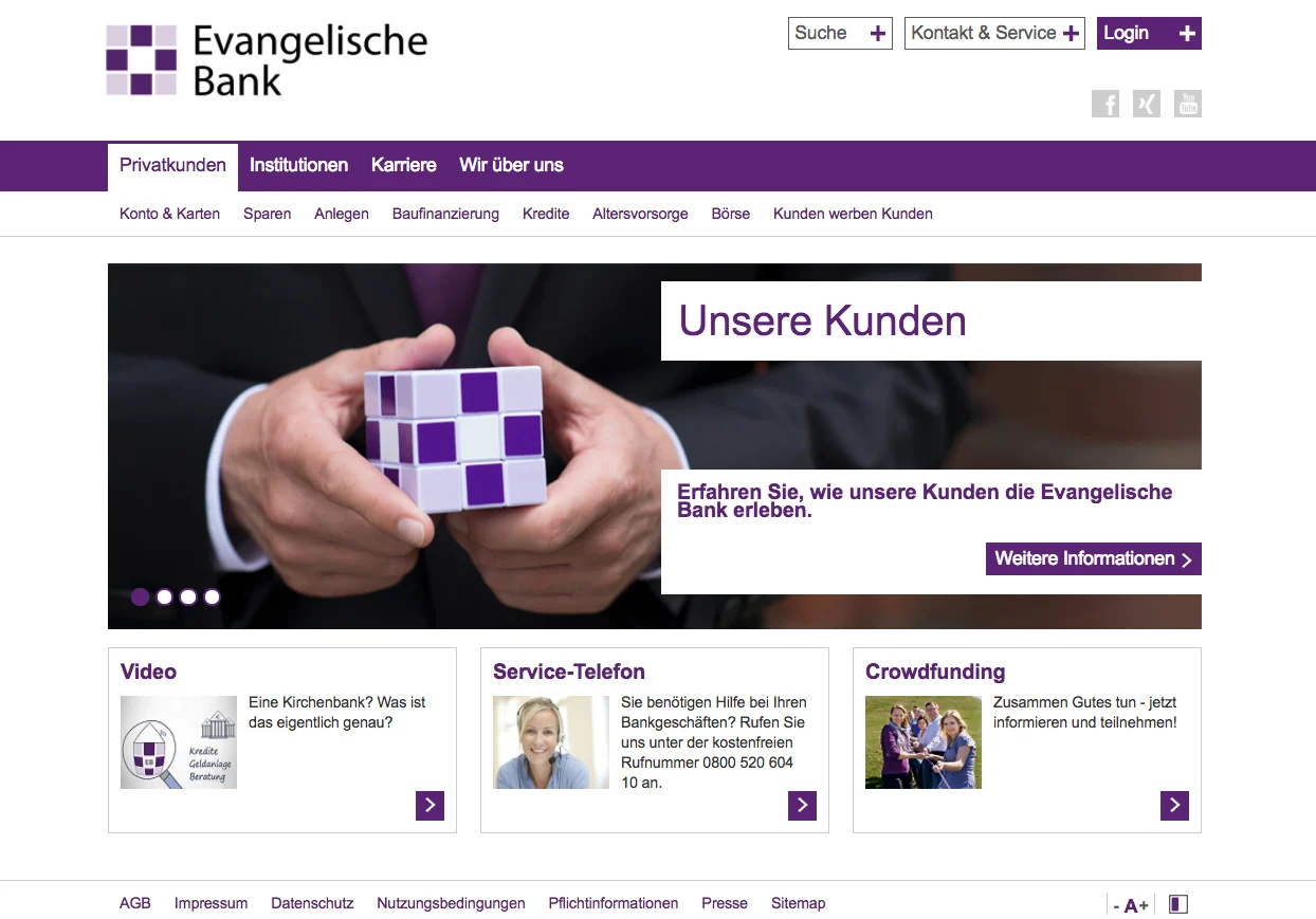
The logo started with a simple idea: reduce the form of a Christian cross to a compact grid of purple squares. The same modular form appears throughout the website, connecting the identity with navigation, buttons, imagery, and smaller interface elements.
My contribution covered logo and website design within Fazit Design’s work for the client. The archived material shows how the identity moved from a standalone mark into a broader digital application.
What was created
The project produced a new visual identity and website design for Evangelische Bank. A Christian cross became a simple modular mark that could work on its own and across navigation, calls to action, editorial imagery, and service content.
Looking back
I am still particularly proud of the logo. Its construction is extremely simple: a Christian cross translated into a square grid. That reduction gave the mark its own character without losing the reference behind it. More than ten years later, Evangelische Bank is still using it.