ZDF DetLines / Cross-platform UX / Design system foundations
Turning a fragmented cross-platform experience into a shared interaction language.
The ZDF media library runs on mobile, desktop, TV, Android TV and HbbTV. Within a collaboration with ZDF that lasted about three years, I led the UX-side inventory of that landscape: how the same functions worked on each device, where they drifted apart, and what that meant for a shared system.
Senior UX designer focused on cross-device analysis, pattern inventory and the foundations of a shared design system.
01 Context
One service. Many different interaction contexts.
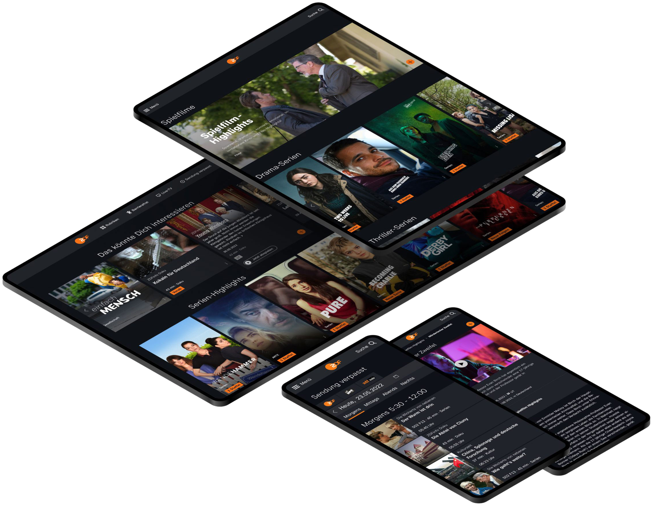
ZDF’s media library is one product that has to behave like five. The same content and the same functions run on a phone on the train, a desktop browser at a desk, a TV from the couch, an Android TV app and HbbTV on a broadcast-connected set. Each of these is a different interaction context, not just a different screen size.
DetLines was the design system phase of a longer collaboration with ZDF, about three years in total. The phase itself ran roughly three months and I was involved from the start. The cross-platform span was not a technical footnote. It was the design problem.
02 The problem
Drift across platforms: grown, not designed.
The component landscape had grown over time. New components were added when they were needed, not always thought through across all platforms, and sometimes finished on the development side. The same function ended up behaving differently depending on where you met it. Some states were missing entirely.
That drift was structural, not cosmetic. Nobody designed the inconsistency. It accumulated, platform by platform and component by component.
Mobile
Reduced state
Desktop
TV
Larger type, fewer elements
Android TV
Diverged order
HbbTV
Missing states
Abstract reconstruction, 2026. The same function on five platforms, before alignment.
03 Understanding usage
Same person. Different device, different need.
A person does not use the media library in one sitting on one device.
I worked with personas that moved through a day of media use: starting something on the phone during the commute, continuing on the TV in the evening, looking something up on the desktop in between. The needs changed with the situation. The couch is not the commute.
TV viewing distance means larger type and larger targets. A mobile session means less information on screen and different priorities. These are not stylistic preferences. They follow from distance, input and attention, and they shaped the requirements I derived for each platform.
On the move
Short sessions, touch input and limited attention.
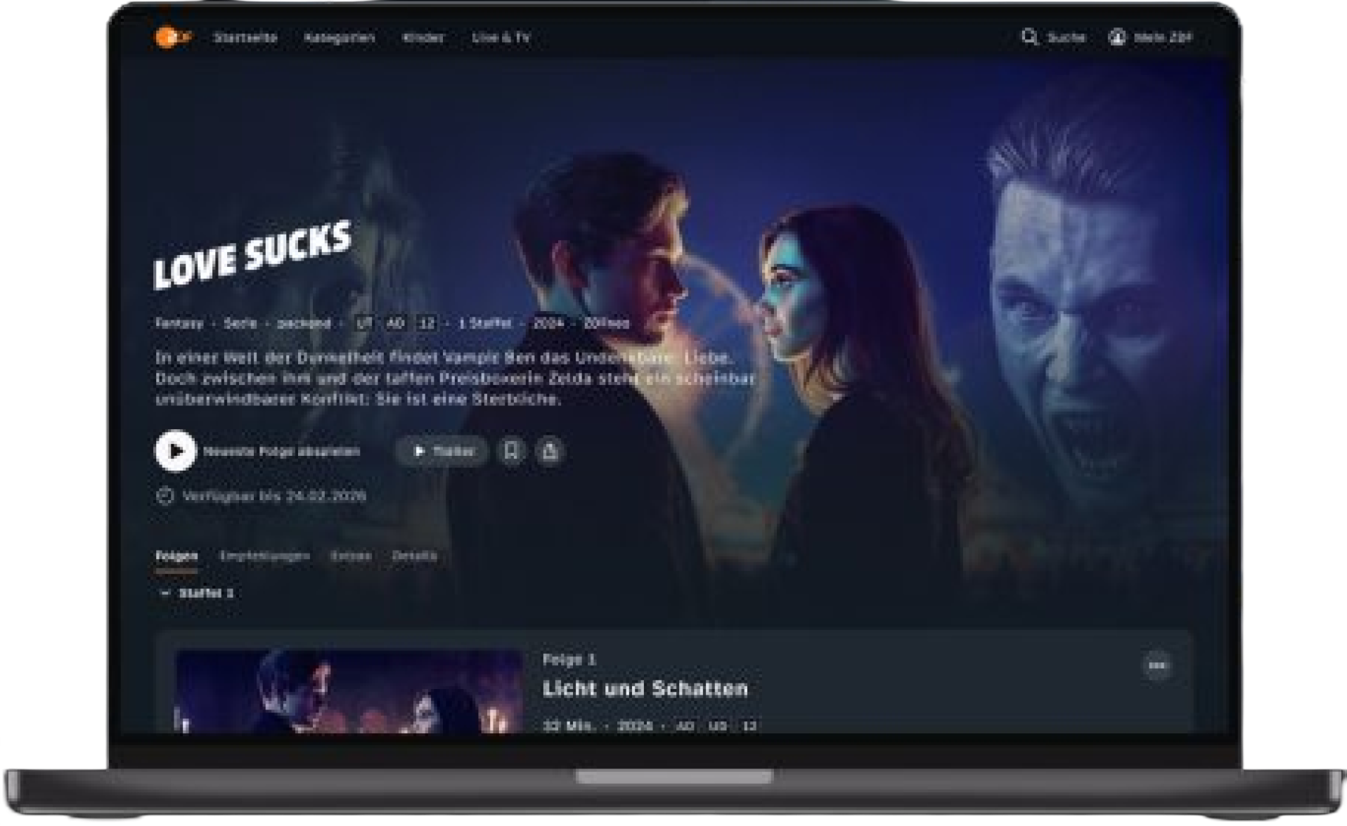
At a desk
A denser overview for focused use with mouse and keyboard.
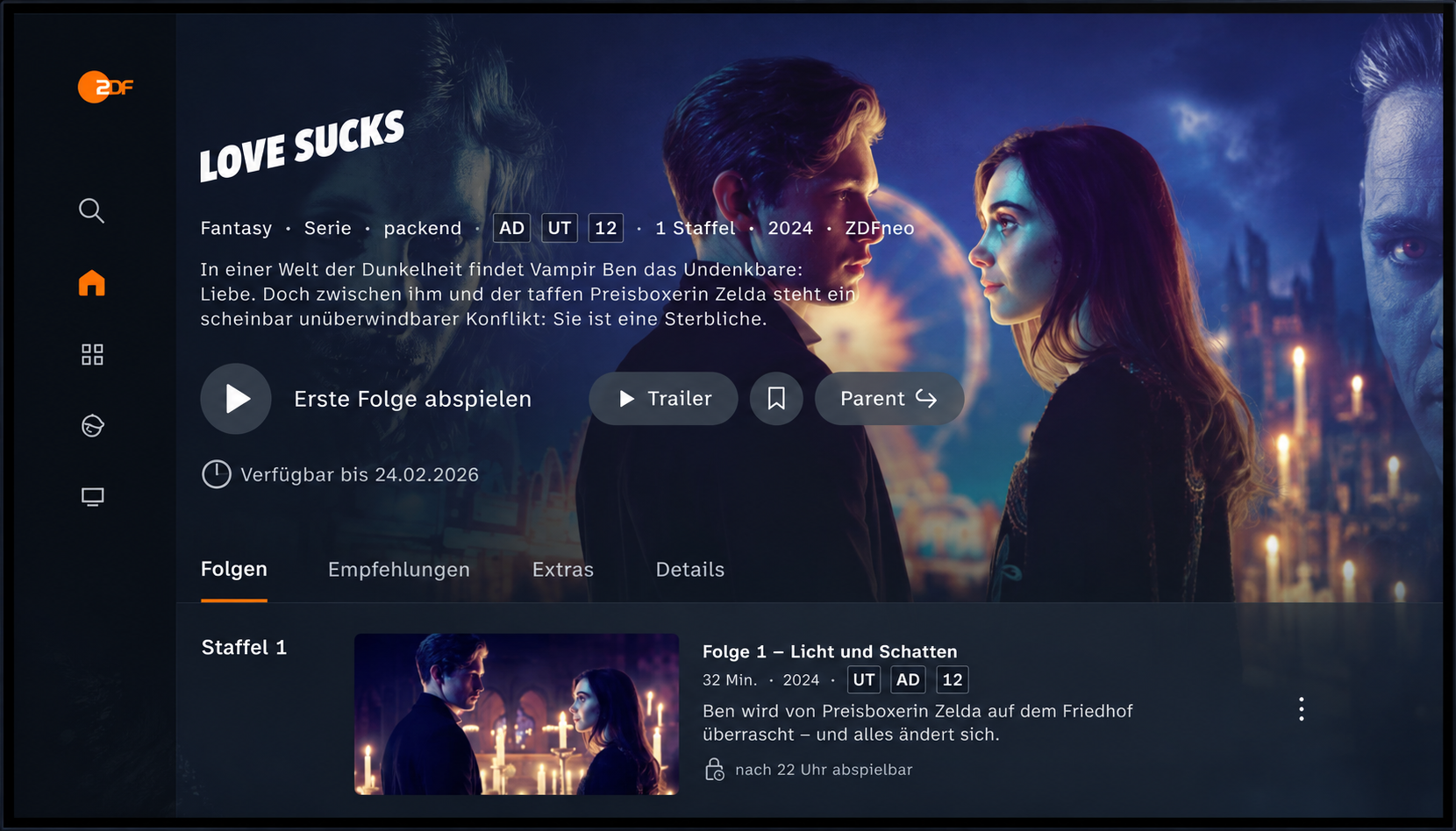
From the couch
Couch distance, remote control, larger type and fewer elements.
04 The inventory
The inconsistencies only became visible side by side.
My core method was direct: take one function, capture it on every device, and compare.
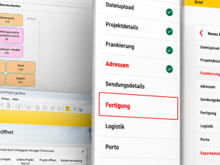
I picked a function and went through each platform with it. Mobile, desktop, TV, Android TV, HbbTV. Screenshots, placed side by side. Then I documented what existed, what was missing and where the behaviour diverged. Differences that were hard to see inside each platform became obvious in one shared row.
I took every round of findings into the next client call with ZDF: what diverged, what was missing, what needed to be aligned across platforms. The open topics moved into the backlog.
R-ZDF-001 / Fragmentation to shared language
Process reconstruction, 2026
Stage 01Fragmented implementations
Mobile
Reduced
TV
Larger type
HbbTV
Missing states
Stage 02Cross-device inventory
Mobile
TV
HbbTV
Stage 03Comparison & mapping
Mobile
→
Teaser A
TV
→
Teaser B
HbbTV
→
Gap: no variant
Stage 04Shared interaction language
One function, checked on every device, documented: what is there and what is missing. That comparison was the heart of the work.
05 Shared logic
Consistent does not mean identical.
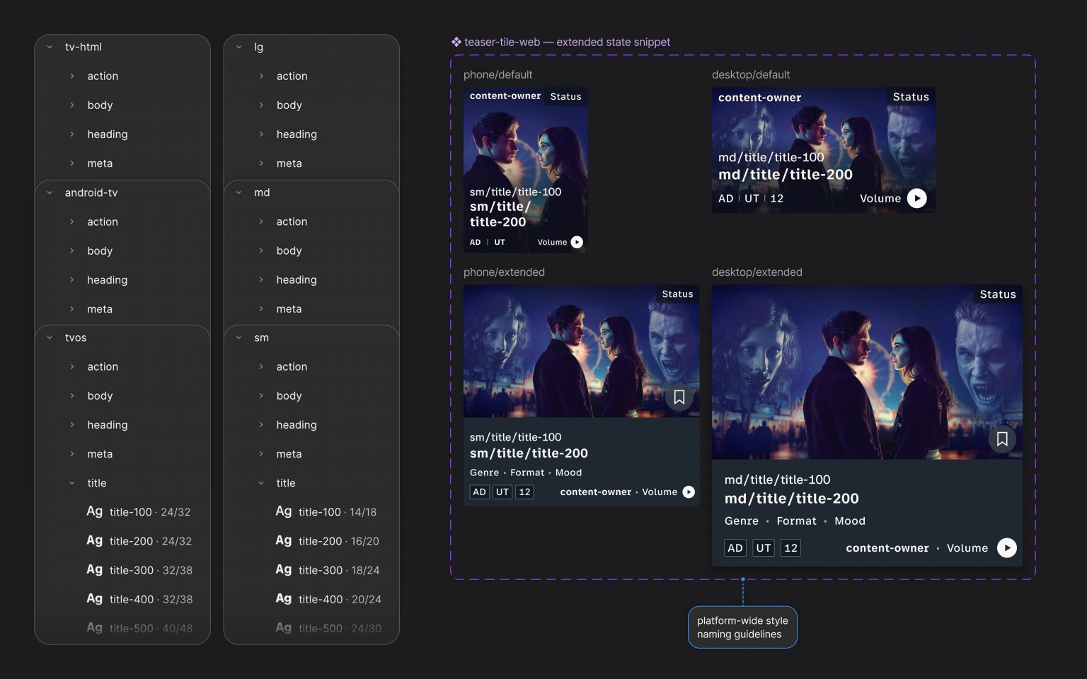
The rule that came out of these comparisons: consistency means the same underlying logic, adapted to device, input and situation. Not the same screen everywhere.
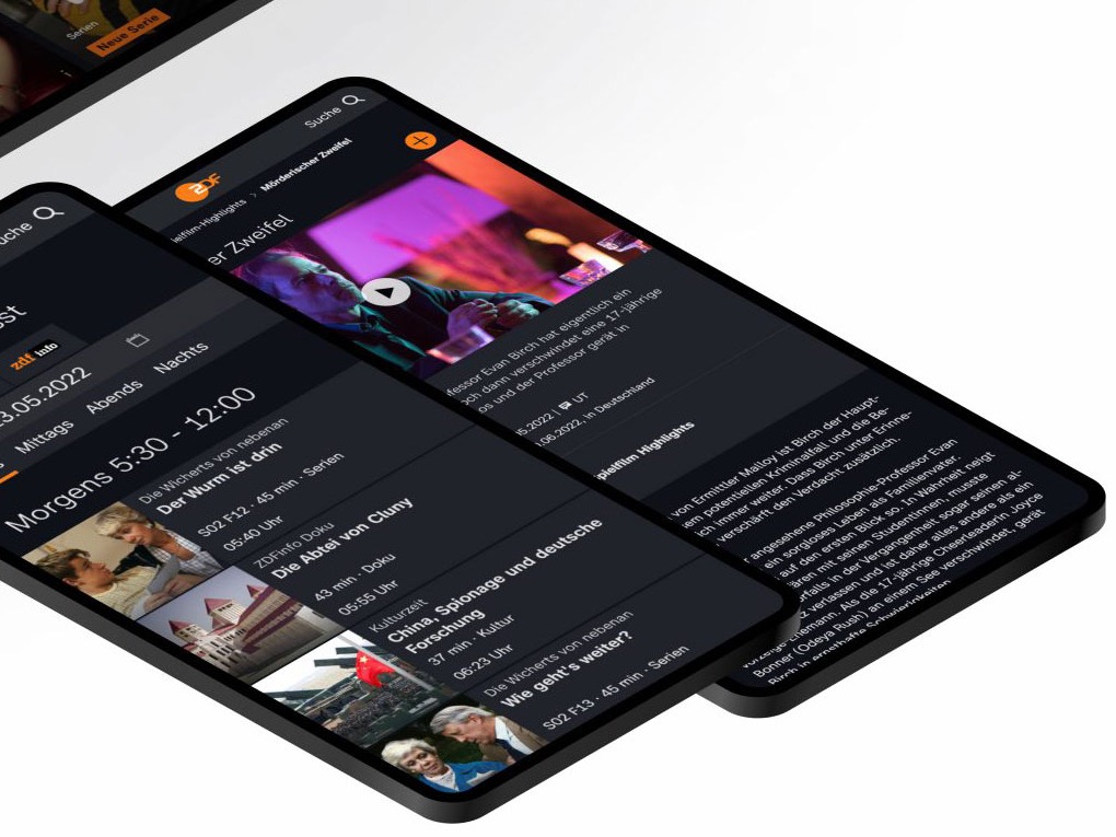
A TV surface keeps the logic and changes the expression: fewer elements, larger type, targets that work from the couch with a remote. A mobile surface keeps the logic and reduces the information to what the situation allows. The function stays recognisable. The form follows the context.
Tablet / larger screen, more elements
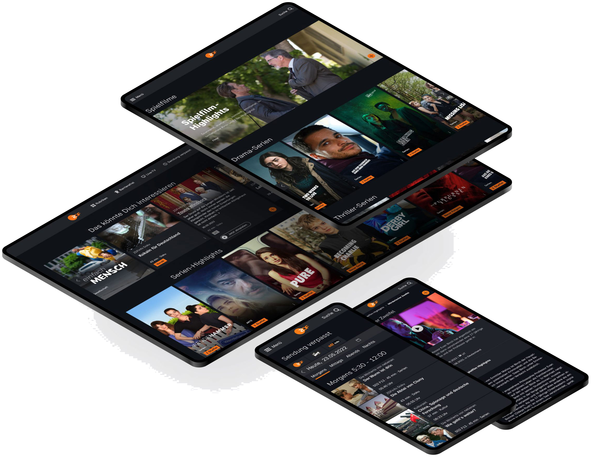
Mobile / short session and touch input
06 From findings to system
Analysis became the shared foundation.
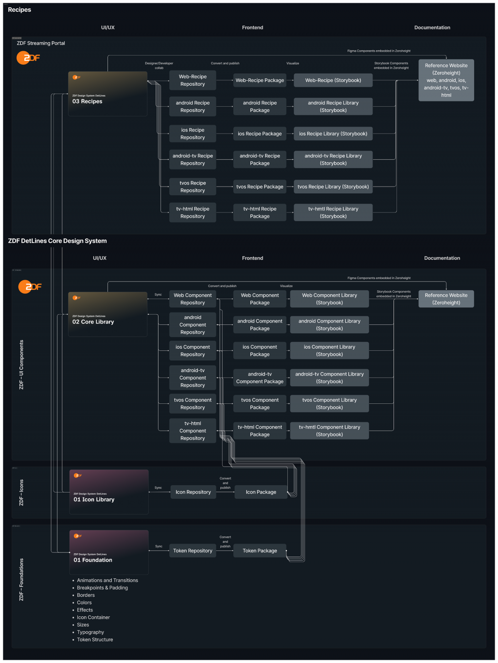
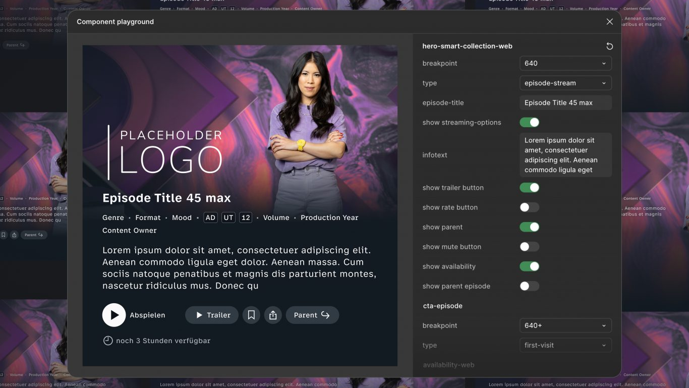
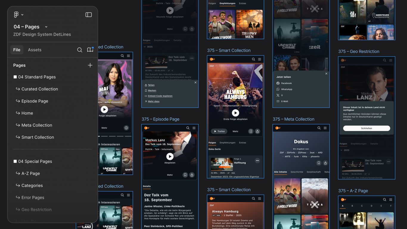
I presented the findings in client calls, aligned them with ZDF and moved the gaps into the backlog. On that basis, we consolidated components into modules, with rules for how each module behaves on different devices.
The analysis became the conceptual groundwork for the shared system: a documented component library as a team output. The project was recognised with a 2022 UX Design Award, Product category.
Beyond DetLines
In another part of my work with ZDF, I designed the UX and concept for an age and ID verification: the input fields sat directly on a visual representation of the ID document, so users could see which number was being asked for and where to find it. The solution reduced that transfer effort and went into production. I also prepared and co-led workshops with ZDF on site. Both are part of the broader ZDF collaboration.
07 Reflection
A design system is never finished.
What stays with me most: a design system is a living system, not a deliverable.
Today I would structure such a system more deliberately from the start and document it on three levels at once: visually, in writing and in code. When a component changes, the system should show which other platforms and modules are affected, so the change propagates instead of creating the next drift.
I would also evolve a system continuously instead of planning the next big relaunch. If a border radius changes from 8 to 16 pixels, that change should be able to run through the whole system iteratively. That is what governance means in practice, and it is harder than shipping a new version every few years.
Today this kind of analysis could move faster with code-based comparison and AI support: spotting drift across platforms, tracing what a change affects, keeping documentation close to the code. That is a present-day perspective, not part of the historical project.