

Earlier work
Flowmotor
Flowmotor brought strategy, tasks, and people development into one enterprise platform. I worked on a visual rebrush of the product and the UX and UI for a new People module.
Context
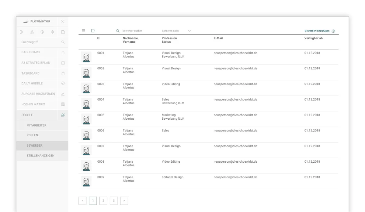
As the platform grew, the People module had to accommodate a dense mix of employee information without turning every profile into a maze. Personal data, positions, skills, development goals, and assessments all needed a place in the same system.
My role
My work covered the UX and UI of the new module as well as a broader visual rebrush of the surrounding product.
Making the information scannable
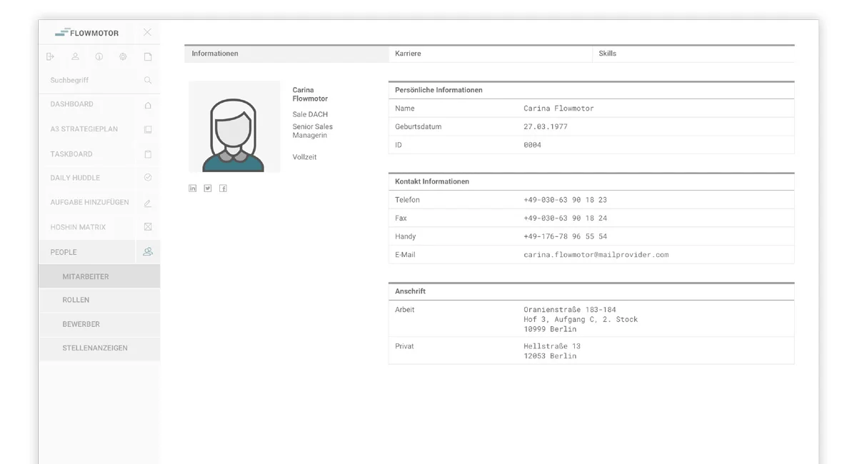
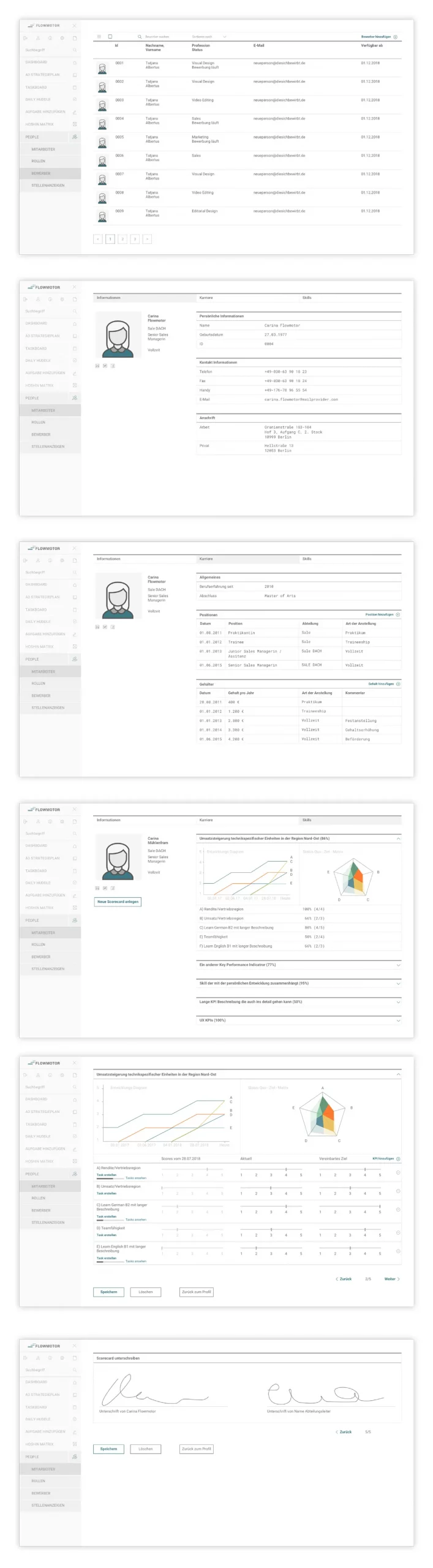
The interface uses a persistent product navigation and a list-to-detail structure. Within each employee profile, information is separated into clear sections for general data, career history, and skills.
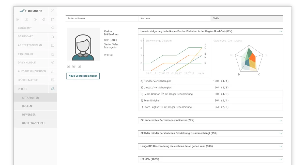
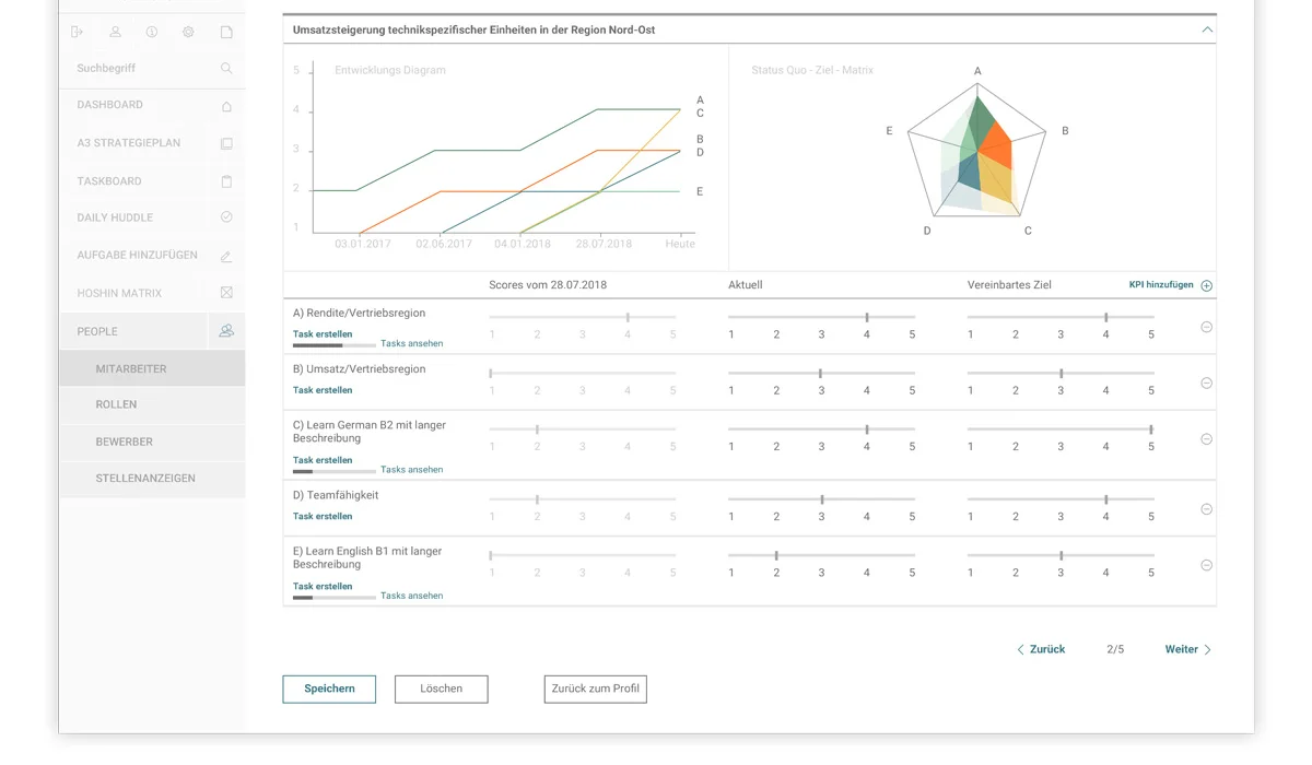
Scorecards combine line and radar charts with detailed tables underneath. This gives the overview and the individual values their own space instead of forcing everything into one visualisation.
What was created
The design concept covered the main employee list, profile information, positions and salary history, skills, development scorecards, detailed assessments, and a final signature step. Together, these screens defined how HR information and development data could be accessed within the new module.
View the complete interface presentation
Looking back
Flowmotor marked an early step from communication design towards complex digital product work. Working with dense employee data made information architecture and role-based interfaces a much bigger part of my practice. The task was no longer just to arrange content, but to design a system people could navigate and use.